Select HTML là thẻ được sử dụng để tạo ra các danh sách lựa chọn dạng thả xuống (dropdown list) trong biểu mẫu (form) trên website. Nhờ vào tính đơn giản, dễ thao tác và khả năng ứng dụng cao, thẻ <select> thường xuyên được sử dụng trong các form đăng ký, form liên hệ hay bất kỳ trường hợp nào yêu cầu lựa chọn từ danh sách (list). Bài viết này sẽ hướng dẫn bạn sử dụng thẻ select hiệu quả để nâng cao trải nghiệm người dùng trên trang web.
Đọc bài viết sau để được giải đáp chi tiết hơn về:
- Tổng quan về thẻ select trong HTML, bao gồm định nghĩa, cú pháp, tiện ích, trình duyệt hỗ trợ và ví dụ.
- Các thuộc tính của thẻ <select> thường gặp.
- Hướng dẫn cách định dạng (custom) menu thẻ select trong HTML.
- Làm thế nào để định dạng checkbox của thẻ select.
- Câu hỏi thường gặp về thẻ select.
Giới thiệu về thẻ select HTML
Thẻ HTML <select> được sử dụng để tạo danh sách thả xuống (dropdown) và thường được sử dụng trong biểu mẫu (form) để thu thập dữ liệu đầu vào của người dùng. Ngoài ra, thẻ <select> được hỗ trợ trong hầu hết các trình duyệt như Google Chrome, Microsoft Edge, Opera, Firefox hay Safari.
Cú pháp:
<select>

    <option>

{nội dung tùy chọn}

    </option>

    ...

</select>
Trong đó,
- Các thẻ <option> bên trong <select>: Giúp hiển thị các lựa chọn có sẵn, cung cấp chức năng để chọn một hoặc nhiều tùy chọn từ danh sách.
- Thuộc tính name: Được sử dụng để tham chiếu dữ liệu biểu mẫu sau khi được gửi, nếu bạn bỏ qua thuộc tính name thì sẽ không có dữ liệu nào từ dropdown được gửi.
- Thuộc tính id: Giúp liên kết danh sách thả xuống với label.
Để hiểu rõ hơn về select, bạn có thể tham khảo qua ví dụ cơ bản như sau:
<!DOCTYPE html>
<html>
<body>

<h1>Thẻ select HTML</h1>

<p>Thẻ select được sử dụng để tạo danh sách drop-down</p>

<form action="/action_page.php">
  <label for="cars">Lựa chọn một loại xe:</label>
  <select name="cars" id="cars">
    <option value="mescedes">Mescedes</option>
    <option value="lexus">Lexus</option>
    <option value="audi">Audi</option>
    <option value="bmw">BMW</option>
  </select>
  <br><br>
  <input type="submit" value="Submit">
</form>

<p>Nhấp vào nút "Submit" và dữ liệu biểu mẫu sẽ được gửi đến một trang trên
máy chủ có tên là "action_page.php".</p>

</body>
</html>
Kết quả hiển thị của đoạn mã trên:
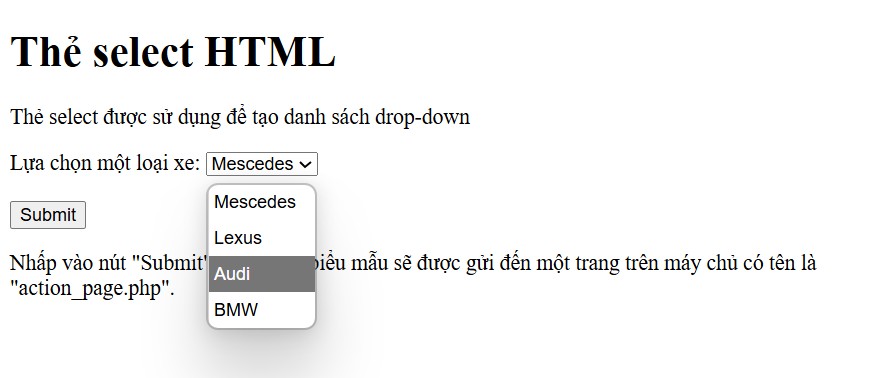
Ở ví dụ trên, là một form đơn giản với thẻ <select> dùng để tạo danh sách drop-down cho phép người dùng chọn một loại xe. Khi người dùng chọn xe và nhấn nút Submit, dữ liệu sẽ được gửi đến trang /action_page.php trên máy chủ (đây là URL giả định, bạn cần có file xử lý phía server ở đó).
Các thuộc tính phổ biến của thẻ select HTML
Để sử dụng thẻ <select> hiệu quả, bạn nên hiểu rõ các thuộc tính phổ biến của thẻ. Điều này sẽ giúp tùy chỉnh hành vi và giao diện của dropdown hiệu quả hơn. Bên cạnh đó, thẻ <select> cũng có hỗ trợ các thuộc tính toàn cục (global attributes) và thuộc tính sự kiện (event attribute).
Dưới đây là những thuộc tính thường được dùng nhất khi làm việc với thẻ <select>.
| Thuộc tính | Giá trị (value) | Chi tiết |
| autofocus | autofocus | Tự động tập trung vào menu thả xuống (dropdown) khi tải trang. |
| disabled | disabled | Tắt menu thả xuống, dẫn đến không thể nhấn hoặc sử dụng menu. |
| form | form_id | Chỉ định ID của biểu mẫu mà phần tử <select> sẽ liên kết tới, kể cả nếu <select> không nằm bên trong biểu mẫu đó. |
| multiple | multiple | Cho phép chọn nhiều giá trị từ menu. |
| name | name | Xác định tên cho menu thả xuống, dùng để tham chiếu dữ liệu biểu mẫu hoặc trong JavaScript. |
| required | required | Đảm bảo người dùng chọn một giá trị trước khi gửi biểu mẫu. |
| size | number | Xác định số tùy chọn hiển thị trong danh sách thả xuống. |
Hướng dẫn tùy chỉnh (custom) menu thẻ select HTML
Trong nhiều trường hợp, thẻ <select> mặc định trong HTML có giao diện khá đơn giản và thiếu linh hoạt trong thiết kế. Để nâng cao trải nghiệm người dùng cũng như đồng bộ giao diện với tổng thể website, việc tuỳ chỉnh menu chọn là điều cần thiết.
Định dạng menu drop-down với CSS
Đoạn mã dưới đây là một ví dụ về tạo form HTML có sử dụng thẻ <select> để tạo một menu chọn các hãng xe. Ngoài ra, phần CSS giúp định dạng lại giao diện cho label và select box.
<html>
<head>
<style>

label {
font-family: Arial, sans-serif;
font-size: 14px;
}

select {
width: 150px;
padding: 5px;
border: 1px solid #ccc;
border-radius: 4px;
font-family: Arial, sans-serif;
font-size: 14px;
}

</style>
</head>
<body>
<form>
<label for="cars">Select a car brand:</label>
<select id="cars" name="cars">
<option value="mescedes">Mescedes</option>
            <option value="lexus">Lexus</option>
            <option value="audi">Audi</option>
            <option value="bmw">BMW</option>
</select>
</form>
</body>
</html>
Kết quả hiển thị của đoạn mã trên:
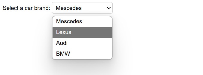
Đoạn mã trên minh hoạ một menu chọn (dropdown menu) cơ bản và dễ hiểu, được định dạng nhẹ nhàng bằng CSS, phù hợp dùng trong các form đăng ký, khảo sát,…
Giải thích:
- <style>: Định dạng tất cả thẻ <label>, font chữ: Arial, sans-serif. Cỡ chữ: 14px, dễ nhìn trên các thiết bị phổ thông.
- Định dạng cho thẻ <select>: Chiều rộng là 150px. Padding 5px (tạo khoảng cách giữa nội dung và viền). Viền 1px, màu xám nhạt (#ccc). Bo góc 4px – tạo cảm giác mềm mại, hiện đại.
- <label for=”cars”>: liên kết label với <select> có id=”cars”, giúp tăng khả năng truy cập và UX.
- <select id=”cars” name=”cars”>: Tạo một dropdown menu. Thuộc tính name=”cars” giúp gửi giá trị được chọn khi submit form.
- <option>: Là các lựa chọn trong menu. Value là giá trị sẽ được gửi trong form (ví dụ: “audi”). Nội dung giữa thẻ là hiển thị cho người dùng.
Menu Drop-down với Placeholder
Ví dụ dưới đây sẽ tạo một menu dropdown chọn trái cây, trong đó có placeholder mặc định: “Select a fruit” và phần option bị vô hiệu hóa (disabled).
<html>
<head>
<style>

select {
width: 200px;
padding: 6px;
border: 1px solid #888;
border-radius: 5px;
background-color: #f9f9f9;
font-family: Verdana, sans-serif;
font-size: 13px;
}

option[disabled] {
color: #999;
}

</style>
</head>
<body>
<form>
<label for="fruits">Choose a fruit:</label>

<select id="fruits" name="fruits">
<option value="" disabled selected>Select a fruit</option>
<option value="apple">Apple</option>
<option value="banana">Banana</option>
<option value="cherry">Cherry</option>
</select>

</form>
</body>
</html>
Kết quả hiển thị của đoạn mã trên:
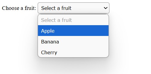
Ở đoạn mã trên, select sẽ mặc định hiển thị placeholder, nhưng khi chọn một option khác, placeholder sẽ không được chọn lại. Cụ thể:
- Sử dụng CSS để định dạng thẻ <select>: Với các thuộc tính như width, padding, border, border-radius, background-color, font-family hay font-size.
- <label for=”fruits”>: Gắn nhãn “Choose a fruit” cho menu, cải thiện accessibility.
- <select id=”fruits” name=”fruits”>: Khởi tạo dropdown với ID và name để dùng trong xử lý form.
- disabled: không cho chọn (chỉ hiển thị gợi ý).
- selected: Mặc định được chọn khi trang được load xong
Làm thế nào để tùy chỉnh hộp chọn (select box)?
Tùy chỉnh bằng cách tạo mới <select> từ JavaScript
Hộp chọn (select box) trong HTML mặc định có giao diện khá đơn giản và hạn chế trong việc tùy chỉnh kiểu dáng. Trong nhiều trường hợp, bạn có thể thiết kế select box sao cho phù hợp với giao diện tổng thể của trang web hoặc ứng dụng bằng cách tạo mới <select> bằng JavaScript. Tuy nhiên, cách này có thể gây ra cồng kềnh trong source code và ảnh hưởng đến hiệu suất.
Vậy làm thế nào để tùy chỉnh select box bằng JavaScript? Đầu tiên, bạn tạo menu chọn tùy chỉnh với mã HTML:
<div class="custom-select" style="width:200px;">
  <select>
    <option value="0">Select car:</option>
    <option value="1">Audi</option>
    <option value="2">BMW</option>
    <option value="3">Lexus</option>
    <option value="4">Ford</option>
    <option value="5">Honda</option>
    <option value="6">Jaguar</option>
    <option value="7">Rolls-Royce</option>
    <option value="8">Mercedes</option>
    <option value="9">KIA</option>
    <option value="10">Nissan</option>
    <option value="11">Toyota</option>
    <option value="12">Volvo</option>
  </select>
</div>
Ở đoạn mã trên, đã tạo một dropdown (select box) cho phép người dùng chọn một hãng xe. Việc để select bên trong thẻ <div class=”custom-select”> gợi ý rằng có thể có CSS hoặc JavaScript bên ngoài để tùy chỉnh giao diện hoặc hành vi của select box ( thay đổi kiểu dáng, thêm icon, hoặc tạo dropdown tùy chỉnh).
- class=”custom-select”: Đây là lớp CSS được đặt tên để có thể áp dụng các kiểu dáng tùy chỉnh cho phần tử chứa select box.
- style=”width:200px;”: Đặt chiều rộng cố định cho vùng chứa là 200 pixel. Điều này giúp kiểm soát kích thước của select box bên trong.
- Thẻ <select>: Không có thuộc tính id hay name trong đoạn mã này, nên nếu dùng trong form cần bổ sung để gửi dữ liệu.
- Mỗi <option>: Đại diện cho một lựa chọn trong dropdown. Giá trị value của mỗi option là một số nguyên từ 0 đến 12, tương ứng với từng hãng xe.
Tiếp theo, bạn viết thêm một đoạn mã CSS để định dạng hộp tùy chọn (select box).
.custom-select {
  position: relative;
  font-family: Arial;
}

.custom-select select {
  display: none; /*hide original SELECT element: */
}

.select-selected {
  background-color: DodgerBlue;
}

/* Style the arrow inside the select element: */
.select-selected:after {
  position: absolute;
  content: "";
  top: 14px;
  right: 10px;
  width: 0;
  height: 0;
  border: 6px solid transparent;
  border-color: #fff transparent transparent transparent;
}

/* Point the arrow upwards when the select box is open (active): */
.select-selected.select-arrow-active:after {
  border-color: transparent transparent #fff transparent;
  top: 7px;
}

/* style the items (options), including the selected item: */
.select-items div,.select-selected {
  color: #ffffff;
  padding: 8px 16px;
  border: 1px solid transparent;
  border-color: transparent transparent rgba(0, 0, 0, 0.1) transparent;
  cursor: pointer;
}

/* Style items (options): */
.select-items {
  position: absolute;
  background-color: DodgerBlue;
  top: 100%;
  left: 0;
  right: 0;
  z-index: 99;
}

/* Hide the items when the select box is closed: */
.select-hide {
  display: none;
}

.select-items div:hover, .same-as-selected {
  background-color: rgba(0, 0, 0, 0.1);
}
Đoạn CSS này có công dụng tạo một dropdown select box tùy chỉnh, ẩn đi select gốc và thay thế bằng các phần tử HTML khác (thường là div) với giao diện đẹp hơn và dễ tùy biến.
- .custom-select: Thiết lập position: relative để làm cơ sở định vị cho các phần tử con có position: absolute bên trong. Đặt font chữ chung cho toàn bộ vùng chứa là Arial.
- display: none; Ẩn thẻ <select> gốc đi để không hiển thị mặc định của trình duyệt. Đây là bước cần thiết khi tạo select box tùy chỉnh bằng HTML, CSS, hoặc JavaScript thay thế cho select mặc định.
- .select-selected: Đây thường là phần tử hiển thị giá trị đã chọn hiện tại của dropdown. Đặt nền màu xanh DodgerBlue để nổi bật.
- .select-selected:after: Tạo mũi tên nhỏ (arrow) bên phải dropdown bằng cách dùng border tạo hình tam giác.
- position: absolute đặt mũi tên ở góc trên bên phải (top: 14px, right: 10px). Màu mũi tên là trắng (#fff) hướng xuống dưới (tam giác chỉ xuống).
- .select-selected.select-arrow-active:after: Khi dropdown mở (có class select-arrow-active), mũi tên đổi hướng lên trên.
- .select-items div, .select-selected: Áp dụng style chung cho các mục trong dropdown (.select-items div) và phần hiển thị giá trị đã chọn (.select-selected).
- .select-items: Đây là container chứa các lựa chọn dropdown.
- .select-hide: Class dùng để ẩn dropdown khi không cần hiển thị (display: none).
- .select-items div:hover, .same-as-selected: Khi rê chuột vào một mục trong dropdown hoặc mục đó đã được chọn (same-as-selected), nền đổi thành màu đen mờ (rgba(0, 0, 0, 0.1)) tạo hiệu ứng hover và highlight.
Cuối cùng, bạn thêm mã JavaScript để hoàn thành quá trình định dạng cho hộp chọn.
var x, i, j, l, ll, selElmnt, a, b, c;
/* Look for any elements with the class "custom-select": */
x = document.getElementsByClassName("custom-select");
l = x.length;
for (i = 0; i < l; i++) {
  selElmnt = x[i].getElementsByTagName("select")[0];
  ll = selElmnt.length;
  /* For each element, create a new DIV that will act as the selected item: */
  a = document.createElement("DIV");
  a.setAttribute("class", "select-selected");
  a.innerHTML = selElmnt.options[selElmnt.selectedIndex].innerHTML;
  x[i].appendChild(a);
  /* For each element, create a new DIV that will contain the option list: */
  b = document.createElement("DIV");
  b.setAttribute("class", "select-items select-hide");
  for (j = 1; j < ll; j++) {
    /* For each option in the original select element,
    create a new DIV that will act as an option item: */
    c = document.createElement("DIV");
    c.innerHTML = selElmnt.options[j].innerHTML;
    c.addEventListener("click", function(e) {
        /* When an item is clicked, update the original select box,
        and the selected item: */
        var y, i, k, s, h, sl, yl;
        s = this.parentNode.parentNode.getElementsByTagName("select")[0];
        sl = s.length;
        h = this.parentNode.previousSibling;
        for (i = 0; i < sl; i++) {
          if (s.options[i].innerHTML == this.innerHTML) {
            s.selectedIndex = i;
            h.innerHTML = this.innerHTML;
            y = this.parentNode.getElementsByClassName("same-as-selected");
            yl = y.length;
            for (k = 0; k < yl; k++) {
              y[k].removeAttribute("class");
            }
            this.setAttribute("class", "same-as-selected");
            break;
          }
        }
        h.click();
    });
    b.appendChild(c);
  }
  x[i].appendChild(b);
  a.addEventListener("click", function(e) {
    /* When the select box is clicked, close any other select boxes,
    and open/close the current select box: */
    e.stopPropagation();
    closeAllSelect(this);
    this.nextSibling.classList.toggle("select-hide");
    this.classList.toggle("select-arrow-active");
  });
}

function closeAllSelect(elmnt) {
  /* A function that will close all select boxes in the document,
  except the current select box: */
  var x, y, i, xl, yl, arrNo = [];
  x = document.getElementsByClassName("select-items");
  y = document.getElementsByClassName("select-selected");
  xl = x.length;
  yl = y.length;
  for (i = 0; i < yl; i++) {
    if (elmnt == y[i]) {
      arrNo.push(i)
    } else {
      y[i].classList.remove("select-arrow-active");
    }
  }
  for (i = 0; i < xl; i++) {
    if (arrNo.indexOf(i)) {
      x[i].classList.add("select-hide");
    }
  }
}

/* If the user clicks anywhere outside the select box,
then close all select boxes: */
document.addEventListener("click", closeAllSelect);
Ở ví dụ trên, có thể thấy:
- Hàm closeAllSelect: Đóng tất cả dropdown khác ngoài dropdown hiện tại (elmnt). Lặp qua tất cả phần tử select-selected và select-items.
- Sự kiện document click: Khi người dùng click bất kỳ vị trí nào ngoài dropdown, tất cả dropdown sẽ đóng lại.
- a.addEventListener: Thêm sự kiện click cho phần hiển thị lựa chọn hiện tại. Khi click, dừng sự kiện lan truyền. Gọi hàm closeAllSelect(this) để đóng các dropdown khác. Mở/đóng dropdown hiện tại bằng cách toggle class select-hide. Toggle class select-arrow-active để thay đổi hướng mũi tên.
- b.appendChild: Thêm tất cả các div option vào div chứa danh sách. Thêm div danh sách vào phần tử custom-select.
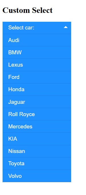
Dưới đây là đoạn mã hoàn chỉnh cùng kết quả hiển thị:
<!DOCTYPE html>
<html>
<head>
<meta name="viewport" content="width=device-width, initial-scale=1.0">
<style>
/*the container must be positioned relative:*/
.custom-select {
  position: relative;
  font-family: Arial;
}

.custom-select select {
  display: none; /*hide original SELECT element:*/
}

.select-selected {
  background-color: DodgerBlue;
}

/*style the arrow inside the select element:*/
.select-selected:after {
  position: absolute;
  content: "";
  top: 14px;
  right: 10px;
  width: 0;
  height: 0;
  border: 6px solid transparent;
  border-color: #fff transparent transparent transparent;
}

/*point the arrow upwards when the select box is open (active):*/
.select-selected.select-arrow-active:after {
  border-color: transparent transparent #fff transparent;
  top: 7px;
}

/*style the items (options), including the selected item:*/
.select-items div,.select-selected {
  color: #ffffff;
  padding: 8px 16px;
  border: 1px solid transparent;
  border-color: transparent transparent rgba(0, 0, 0, 0.1) transparent;
  cursor: pointer;
  user-select: none;
}

/*style items (options):*/
.select-items {
  position: absolute;
  background-color: DodgerBlue;
  top: 100%;
  left: 0;
  right: 0;
  z-index: 99;
}

/*hide the items when the select box is closed:*/
.select-hide {
  display: none;
}

.select-items div:hover, .same-as-selected {
  background-color: rgba(0, 0, 0, 0.1);
}
</style>
</head>

<body>

<h2>Custom Select</h2>

<!--surround the select box with a "custom-select" DIV element. Remember to set the width:-->
<div class="custom-select" style="width:200px;">
  <select>
    <option value="0">Select car:</option>
    <option value="1">Audi</option>
    <option value="2">BMW</option>
    <option value="3">Lexus</option>
    <option value="4">Ford</option>
    <option value="5">Honda</option>
    <option value="6">Jaguar</option>
    <option value="7">Roll Royce</option>
    <option value="8">Mercedes</option>
    <option value="9">KIA</option>
    <option value="10">Nissan</option>
    <option value="11">Toyota</option>
    <option value="12">Volvo</option>
  </select>
</div>

<script>
var x, i, j, l, ll, selElmnt, a, b, c;
/*look for any elements with the class "custom-select":*/
x = document.getElementsByClassName("custom-select");
l = x.length;
for (i = 0; i < l; i++) {
  selElmnt = x[i].getElementsByTagName("select")[0];
  ll = selElmnt.length;
  /*for each element, create a new DIV that will act as the selected item:*/
  a = document.createElement("DIV");
  a.setAttribute("class", "select-selected");
  a.innerHTML = selElmnt.options[selElmnt.selectedIndex].innerHTML;
  x[i].appendChild(a);
  /*for each element, create a new DIV that will contain the option list:*/
  b = document.createElement("DIV");
  b.setAttribute("class", "select-items select-hide");
  for (j = 1; j < ll; j++) {
    /*for each option in the original select element,
    create a new DIV that will act as an option item:*/
    c = document.createElement("DIV");
    c.innerHTML = selElmnt.options[j].innerHTML;
    c.addEventListener("click", function(e) {
        /*when an item is clicked, update the original select box,
        and the selected item:*/
        var y, i, k, s, h, sl, yl;
        s = this.parentNode.parentNode.getElementsByTagName("select")[0];
        sl = s.length;
        h = this.parentNode.previousSibling;
        for (i = 0; i < sl; i++) {
          if (s.options[i].innerHTML == this.innerHTML) {
            s.selectedIndex = i;
            h.innerHTML = this.innerHTML;
            y = this.parentNode.getElementsByClassName("same-as-selected");
            yl = y.length;
            for (k = 0; k < yl; k++) {
              y[k].removeAttribute("class");
            }
            this.setAttribute("class", "same-as-selected");
            break;
          }
        }
        h.click();
    });
    b.appendChild(c);
  }
  x[i].appendChild(b);
  a.addEventListener("click", function(e) {
      /*when the select box is clicked, close any other select boxes,
      and open/close the current select box:*/
      e.stopPropagation();
      closeAllSelect(this);
      this.nextSibling.classList.toggle("select-hide");
      this.classList.toggle("select-arrow-active");
    });
}
function closeAllSelect(elmnt) {
  /*a function that will close all select boxes in the document,
  except the current select box:*/
  var x, y, i, xl, yl, arrNo = [];
  x = document.getElementsByClassName("select-items");
  y = document.getElementsByClassName("select-selected");
  xl = x.length;
  yl = y.length;
  for (i = 0; i < yl; i++) {
    if (elmnt == y[i]) {
      arrNo.push(i)
    } else {
      y[i].classList.remove("select-arrow-active");
    }
  }
  for (i = 0; i < xl; i++) {
    if (arrNo.indexOf(i)) {
      x[i].classList.add("select-hide");
    }
  }
}
/*if the user clicks anywhere outside the select box,
then close all select boxes:*/
document.addEventListener("click", closeAllSelect);
</script>

</body>
</html>
Kết quả hiển thị của đoạn mã trên:
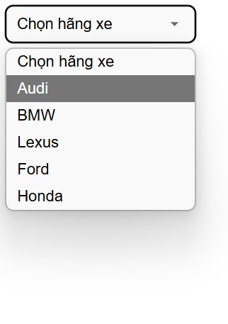
Tùy chỉnh chỉ với CSS
Trong nhiều trường hợp, bạn vẫn có thể cải thiện giao diện của select box chỉ với CSS. Cách này sẽ có thao tác đơn giản, hiệu quả và dễ triển khai hơn.
<style>
.styled-select select {
  appearance: none;         /* Ẩn giao diện mặc định của trình duyệt */
  -webkit-appearance: none; /* Safari/Chrome */
  -moz-appearance: none;    /* Firefox */
  padding: 10px 40px 10px 12px;
  font-size: 16px;
  border: 1px solid #ccc;
  border-radius: 8px;
  background-color: #f9f9f9;
  background-image: url('data:image/svg+xml;utf8,<svg fill="%23666" height="24" viewBox="0 0 24 24" width="24" xmlns="http://www.w3.org/2000/svg"><path d="M7 10l5 5 5-5z"/></svg>');
  background-repeat: no-repeat;
  background-position: right 12px center;
  background-size: 20px;
  cursor: pointer;
  width: 200px;
}
</style>

<div class="styled-select">
  <select>
    <option value="0">Chọn hãng xe</option>
    <option value="1">Audi</option>
    <option value="2">BMW</option>
    <option value="3">Lexus</option>
    <option value="4">Ford</option>
    <option value="5">Honda</option>
  </select>
</div>
Trong đó:
- appearance: none: Ẩn hoàn toàn giao diện gốc của select, giúp bạn dễ dàng tùy biến.
- background-image: Dùng SVG làm mũi tên chỉ xuống, giúp hiển thị đẹp và không cần JavaScript.
- background-position và padding: Căn chỉnh vị trí mũi tên và khoảng cách bên trong.
Kết quả hiển thị của đoạn mã trên:
Câu hỏi thường gặp về thẻ select HTML
Làm thế nào để sử dụng thẻ <select> trong React?
Để sử dụng thẻ select trong React, bạn sẽ sử dụng HTML Select và tạo một mảng (array) cho các tùy chọn. Sử dụng thẻ select và lặp lại các phần tử mảng bên trong bằng cách sử dụng array map để hiển thị các mục dưới dạng tùy chọn.
Trên thẻ <select>, bạn sẽ sử dụng thuộc tính “onChange” để giữ tham chiếu đến hàm “onOptionChangeHandler”. Hàm này sẽ được kích hoạt bất cứ khi nào bạn thay đổi giá trị của dropdown.
Quy trình thực hiện như sau:
Bước 1: Tạo ứng dụng React.js bằng lệnh sau:
npx create-react-app foldername
Bước 2: Sau khi tạo folder cho dự án, tiếp theo bạn hãy di chuyển vào thư mục đó bằng lệnh sau:
cd foldername
Bước 3: Tiếp theo, bạn thực hiện đoạn mã cho dự án của mình. Chẳng hạn như ví dụ dưới đây, sẽ tạo một mục với lựa chọn thả xuống (dropdown option). Trong đó, có một số tùy chọn có trong array đã cho.
// App.js

import React, { useState } from "react";
import "./App.css";

const App = () => {
    const [data, setData] = useState(undefined);

    const options = [
        "HTML",
        "CSS",
        "JavaScript",
        "React",
        "Redux",
    ];
    const onOptionChangeHandler = (event) => {
        setData(event.target.value);
        console.log(
            "User Selected Value - ",
            event.target.value
        );
    };
    return (
        <center>
            <h1> ITviec</h1>
            <h3>HTML select tag in React js</h3>

            <select onChange={onOptionChangeHandler}>
                <option>Please choose one option</option>
                {options.map((option, index) => {
                    return (
                        <option key={index} value={option}>
                            {option}
                        </option>
                    );
                })}
            </select>
            <h3>You selected: {data} </h3>
        </center>
    );
};

export default App;
Để chạy đoạn mã, bạn thực hiện lệnh bên dưới từ thư mục gốc của dự án là npm start. Sau đó sẽ hiển thị kết quả:
- Nội dung trang được căn giữa theo chiều ngang.
- Ở trên cùng có tiêu đề lớn: ITviec
- Bên dưới là tiêu đề nhỏ hơn: HTML select tag in React js
- Tiếp theo là một dropdown (hộp chọn) với lựa chọn đầu tiên là: Please choose one option
- Các lựa chọn trong dropdown gồm: HTML, CSS, JavaScript, React và Redux.
- Khi bạn chọn một tùy chọn bất kỳ trong dropdown, bên dưới hộp chọn sẽ hiển thị dòng tiêu đề: You selected: [tùy chọn đã chọn]
- Ví dụ, nếu bạn chọn “React”, sẽ hiển thị: You selected: React
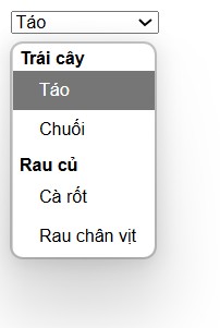
Có thể sử dụng thẻ <optgroup> với <select> không?
Câu trả lời là Có. Phần tử select có thể chứa cả phần tử <option> và <optgroup>. Tuy nhiên, bạn không thể lồng nhiều thẻ <optgroup> với nhau mà chỉ có thể thực hiện một cấp trong select.
<select>
  <optgroup label="Trái cây">
    <option value="apple">Táo</option>
    <option value="banana">Chuối</option>
  </optgroup>
  <optgroup label="Rau củ">
    <option value="carrot">Cà rốt</option>
    <option value="spinach">Rau chân vịt</option>
  </optgroup>
</select>
Kết quả hiển thị của đoạn mã trên:
Làm thế nào để xóa tùy chọn khỏi select box?
Tùy chọn cần xóa sẽ được chọn bằng cách lấy hộp chọn (select box). Giá trị cần xóa được chỉ định trên value selector (value=’optionValue’) trên hộp chọn. Sau đó, phương thức remove() được sử dụng để xóa tùy chọn được chọn này.
Cú pháp:
$("selectBox option[value='optionValue']").remove()
Ví dụ:
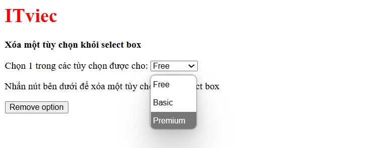
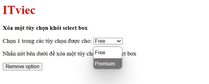
<!DOCTYPE html>
<html>
<head>
<title>
Removing an item from a select box
</title>
</head>

<body>
<h1 style="color: red">
ITviec
</h1>
<b>Xóa một tùy chọn khỏi select box</b>
<p>
Chọn 1 trong các tùy chọn được cho:
<select id="select1">
<option value="free">
Free
</option>
<option value="basic">
Basic
</option>
<option value="premium">
Premium
</option>
</select>
</p>
<p>Nhấn nút bên dưới để xóa một tùy chọn khỏi select box </p>
<button onclick="removeOption()">
Remove option
</button>
<script src=
"https://code.jquery.com/jquery-3.3.1.min.js">
</script>
<script type="text/javascript">
function removeOption() {

/* select the option with the
value of basic and remove the option*/
$("#select1 option[value='basic']").remove();
}
</script>
</body>

</html>
Ví dụ trên tạo một trang web đơn giản với ba tùy chọn (Free, Basic, Premium) và một nút bấm. Khi nhấn nút, tùy chọn có giá trị “basic” sẽ bị xóa khỏi dropdown.
- Thẻ <select> có id “select1” chứa 3 tùy chọn với giá trị tương ứng: “free”, “basic”, “premium”.
- Nút <button> có sự kiện onclick gọi hàm JavaScript removeOption() khi được nhấn.
- Thư viện jQuery phiên bản 3.3.1 được tải về để sử dụng các tiện ích jQuery trong mã JavaScript.
- Hàm removeOption được định nghĩa để xử lý sự kiện khi người dùng nhấn nút.
- Trong hàm, sử dụng jQuery selector $(“#select1 option[value=’basic’]”) để tìm phần tử <option> trong <select> có id select1 với thuộc tính value=”basic”.
- Phương thức .remove() của jQuery sẽ xóa phần tử này khỏi DOM, tức là tùy chọn “Basic” sẽ biến mất khỏi dropdown.
Kết quả hiển thị khi chưa nhấn button:
Kết quả hiển thị khi đã nhấn nút “remove option”:
Hoặc bạn có thể tham khảo thêm cách xóa tùy chọn với JavaScript thuần bằng cách lấy thẻ <select> bằng getElementById.
<!DOCTYPE html>
<html>
<head>
    <title>Xóa tùy chọn bằng JavaScript thuần</title>
</head>
<body>
    <h1 style="color: red">ITviec</h1>
    <b>Xóa một tùy chọn khỏi select box bằng JS thuần</b>
    <p>
        Chọn một trong các tùy chọn:
        <select id="select2">
            <option value="free">Free</option>
            <option value="basic">Basic</option>
            <option value="premium">Premium</option>
        </select>
    </p>
    <p>Nhấn nút bên dưới để xóa một tùy chọn khỏi select box:</p>
    <button onclick="removeOptionJS()">Remove option</button>

    <script type="text/javascript">
        function removeOptionJS() {
            const select = document.getElementById("select2");
            for (let i = 0; i < select.options.length; i++) {
                if (select.options[i].value === "basic") {
                    select.remove(i);
                    break;
                }
            }
        }
    </script>
</body>
</html>
Giải thích ví dụ trên:
- Dùng document.getElementById(“select2”) để lấy thẻ <select>.
- Duyệt qua các options trong select box.
- Nếu option nào có value === ‘basic’, dùng select.remove(i) để xóa option đó.
- Không cần dùng thêm thư viện ngoài, hoạt động thuần trên trình duyệt.
Tổng kết
Select HTML là thẻ cần thiết khi bạn cần xây dựng các form tương tác, giúp cải thiện trải nghiệm người dùng trên website. Khi sử dụng đúng cách, thẻ <select> không chỉ giúp giao diện gọn gàng mà còn tăng tính tương tác và tính chính xác của dữ liệu được nhập. Hy vọng qua bài viết, bạn đã hiểu rõ cách áp dụng thẻ select trong HTML một cách linh hoạt và hiệu quả nhất.
Xem thêm: Giải đáp “tất tần tật” những điều cần biết về HTML